After a few comments on the watercolour process for these comics in the lead up for Full Colour Cromulence, I thought it would be a good idea to reshare this walkthrough I did last year!
Since I was photographing the comic this week, it was a simple step to photograph a few key stages as well, and put together a nice little process post. Here it is!
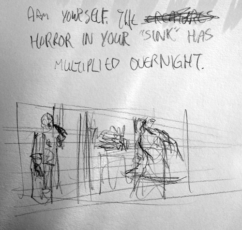
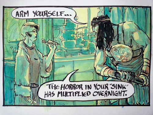
First, I write and thumbnail the comic. Having now drawn both myself and Conan … a lot … I’ve gotten in the habit of shorthanding things. Frankly, the joke is often much harder to hammer out, but this week there were minimal rewrites. (see scribbled out words for insights into the scrapped, unfunny script)
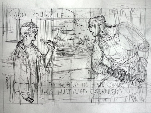
Then I draw out the comic! I’m using Canson’s pre-ruled manga art boards, which are keeping me to a consistent format and also take pencil and ink really nicely. As you can see, I’m much more worried about character expressions than anything else in the shot, judging from the relative darkness of the pencil lines there.
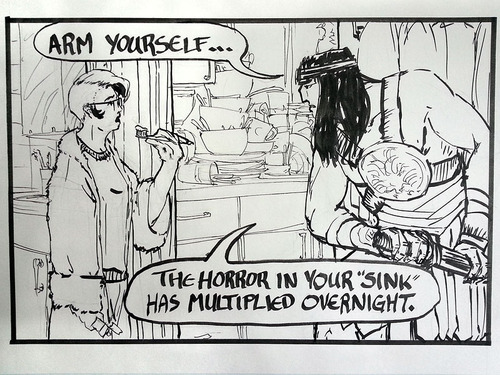
Next step is inking! I’ve got a 100% micron pen inking setup now, partially because micron ink doesn’t bleed under watercolours, which is ideal, but also because I definitely work more legibly with fixed width pens. Any and all expressive linework I do these days I do with a chisel pen, which really helps me feel when I’m getting a thin or thick line. I’m still playing with spotting blacks in these painted comics, so this week’s had almost none.
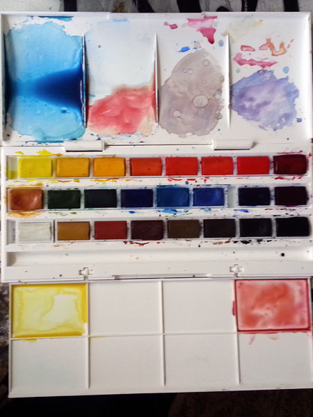
And this, this is my favourite art tool. A Windsor & Newton Cotman Series 24 full-pan travel watercolour set. Real pigments! Pack up and go! Classy, easily cleaned white case! I had a smaller, half-pan set and quickly used up the blues, so this was the logical next step.
The more of these comics I make, the more of a colour system I hammer out. Conan gets strong, warm colours and cold dark hair; I get cooler colour clothes and warm hair and face. I usually do a light, warm-coloured wash now to tie the whole image together and make the word bubbles pop out even more. And I’m getting better at not using the whole palette in every comic - this week I opted out of any cadmiums (the hotter reds and yellows), viridian green or warm blues (cobalt and ultramarine) and used yellow ocher and venetian red really sparingly. Making those calls ahead of time is making colour a LOT less painful for me.
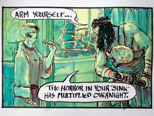
So, first up, the underpainting! That light yellow is a lemon yellow/raw sienna mix, glazed on super light. Then a sap green/phthalo blue combo forms that base green, with a heavier blue glaze to start pushing in the contrast. That warm shadow tone is crimson red/raw sienna, glazed in to start pushing the warms and cools. You can already see how Conan will be the hottest thing in the comic (heh heh heh) with almost no warmth in the background at all.
On a side note, watercolour on manga art boards is probably not ideal, but they actually hold up incredibly well, the pigment sits nicely on top of the paper, and again, minimal bleeding. If anything they suck up water too fast, making it hard to do big wet-in-wet washes.
The contrast really wasn’t working, though, and a lot of the forms felt flat and boring, so here’s a much hotter dark, almost pure crimson, laid in in washes and more opaquely to show the darkest darks and turn and layer a few forms more effectively.
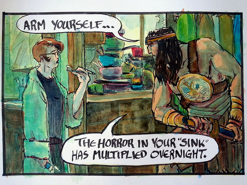
With a lot of my shading done already, I go ahead now and glaze in local colour information. Again, no warm blues, no cadmium reds or yellows, just an array of greens, siennas, umbers and a little cerulean blue to pup out things like that towel, that bowl and my toothpaste. Against that bluegreen background, burnt sienna and crimson red form some really hot oranges, and the tiny spots of yellow ochre (which is really opaque) and some tiny amounts of venetian red (which is an ABSURDLY overpowered pigment) lift Conan right out of the picture at points. Even the sap green is hot enough to stand out against a cool blue background.
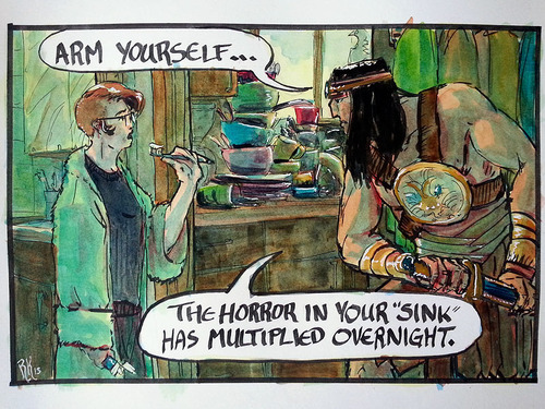
The last touch is letting it all dry and then going in with a white pen. It takes things back into the realm of cartoon, after all my colour noodling, and it helps me pop the shinier things like Conan’s bracers and round chestplate. Also it makes for a sweet signature.
And then I scan it, and clean it up in Photoshop, and pull out the text and make it crisp, and tidy the edges, and clean up all the stray paint in the word bubbles, and generally fiddle around till I think it looks awesome. And then I share it with you!
I hope this was interesting, and not just rambly. I’ve always used By Crom! as a project to experiment with, so as soon as I feel like I’ve got one process down I tend to switch it up and try another - you can probably go back through the watercolour comics and see several different techniques if you look close. So this is certainly no watercolouring or comicking bible, but a selection of this week’s approaches. And there is always more to learn!
Thanks! Cheers!
